|
This piece that I was giving to do an illustration was by M.R James called Whistle and I'll, come my lad, its a ghost story about a professor who goes on holiday to find a mysterious figure following him around, Throughout my research and was very interested in doing in the of artist, after looking at people like Brad Holland, Giorgio De Chirico and Shaun Tan, I decided to have a closer look at Edward Gorey, though he does not use a lot of colour in his work, I thought that would make a bit more challenging for myself. I ended up doing some thumbnails all based on the beach where the Professor was being followed, I wanted to the mysterious figure as he describes as " with horns and wings". Adding colour was again more difficult I than I expected, however I think that I have done a plausible job considering that both my references and the artist don't have a lot of colour.
0 Comments
For this project we were given 6 scenarios where we would use body language as the main attraction. The 6 scenes were;
The Angry Boss Good News Mum Can We Go Now The Anniversary The Big Jump and The Genius At Work. Each illustration should have a different type of body language to each scene. The 9 thumbnails are what I thought would have best presented for that scene and next to it is the final outcome. The Angry Boss- A few of these thumbnails were based off references from movies and images I found from the internet. The Anniversary- This one I had to show a couple who hate each other but still had time to be together on the anniversary, I added in small but subtle hints like the card to show that they were celebrating an occasion. The Big Jump- This one was show someone about to jump off a plane to skydive, I was able to work on the body figure a bit more, I did not want to think to much on this one so I was quick with my thumbnails and got straight into the final image and with a little bit of tweaking and tidying the edges I'm happy with the overall appearance. Genius At Work- The final image I found the most difficult, I think its the hand that doesn't necessarily ruin it but I think it does distract from the real purpose of the piece. Good News- This had to have someone holding a 50s telephone, this might not be fully accurate but I think overall I have told the story of this man on the phone about to get some good news. Mum Can We Go Now- This one was a challenge because I did not want to go into specifics of the characters however, again it does tell a story which is what I am looking for. For this project, we were asked to do thumbnails for 6 different scenes where they all show movement in different ways and emotions. The thumbnails were a good start I was able to understand what every image entails and how I would show movement in each final image.
Ambushed- This one I really wanted to get a backstory behind it, something to make the audience question what had happened as well as what is happening and I think that the process to this was very important because I really wanted to start this project off good. The Giant Leap- This one was out my comfort zone a little, but I don't hate, I actually liked it, the proportions are a bit off but out of the images, this one shows the most movement and if I have got this right then I could definitely see myself doing more in this style. January Sales- This one was a challenge mainly because I wanted to put the same amount of detail in each person but I knew that further away they were, the less detailed they needed to be. If I were go back and do this again, I'd would learn from my mistakes mainly because it looks lazy rather than less detail, I wasn't lazy at the time when I did but I look at it and that is what I see. System Failure- I was really pleased with both the thumbnails and the outcome of this image because it helped me come to realize that just adding tone to an image makes it 100% better and I also enjoyed just designing this piece because I think my stylized drawing made something comedic in a sense that in real life it wouldn't be. Tango- This piece I would have to say that I preferred the thumbnails over the final piece. I wanted to again do it in a style that I liked and it just didn't go to plan as hoped but that means is that when I look back I know what "not" to do. Vertigo- I thought I would still with something simple but again with the previous image ask questions, I added the tree and swerved it into an angle where you think that there's chaos around the building. 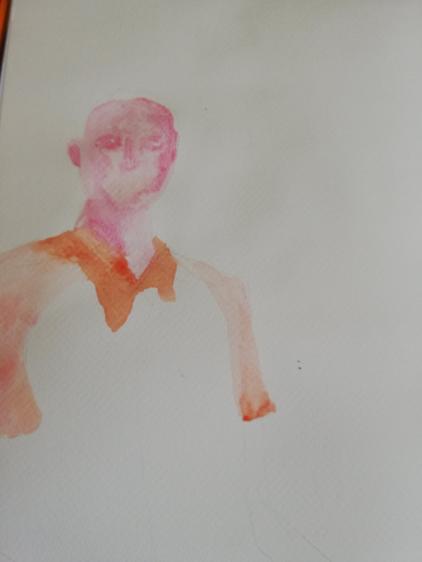  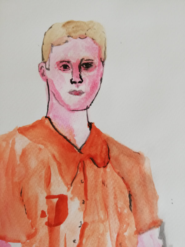  This painting is inspired by the artist John Singer Sargent, This piece was my least favourite to do, so its the one I'm going to more work into, with it not looking like the style of the artists work, I attempted it several time and this one was the most improved out of the lot. For next i'll look into more artists and how they do faces using watercolour paint.
   This painting was inspired by American artist Brad Holland, I have previous tried to do a painting in the style of Brad Holland before and it didn't really work out, but out of all the paintings I have done that are in the style of an artist, this one I personally think is the closest to the artist.
   This is the progression of the acrylic painting that I did that was inspired by J.C. Leyendecker, I was going for the look of how he would just paint the face and hands on a plain background but knowing you can still see a body. I decided to do just the head because I really wanted to try and get the markings right on the face. Its not brilliant to comparison to Leyendecker however I did however I did get it to look like there is a body and not just a floating head, which I am pleased about.
 This watercolour painting was inspired by Eric Ravilious, Ravilious is a British painter, and I chose to do it on him is because of his use of light colours, My work is using a lot of dark tones and shade so in looks of his work compared to mine they do not look alike, however I am pleased with how it came out and though watercolour was very difficult to work with, the overall look I am happy with.
For this task we were to create 3D models of cats and dogs, I decided to do four animals in total; two Cats and two Dogs, using 3 different medias; Cardboard, metal cans and clay. I enjoyed using all 3 medias and I hope to use them again. For research I took a look at an artist I researched back when I was college called Bartek Elsner, he does 3D models using cardboard and the sculptures are incredible, As much as I loved his worked I knew his work was far too complex for this project. I decided to keep it simple by using clay and I did use cardboard for one of my models but I do think that I could have done more.
|
AuthorWrite something about yourself. No need to be fancy, just an overview. ArchivesCategories |


 RSS Feed